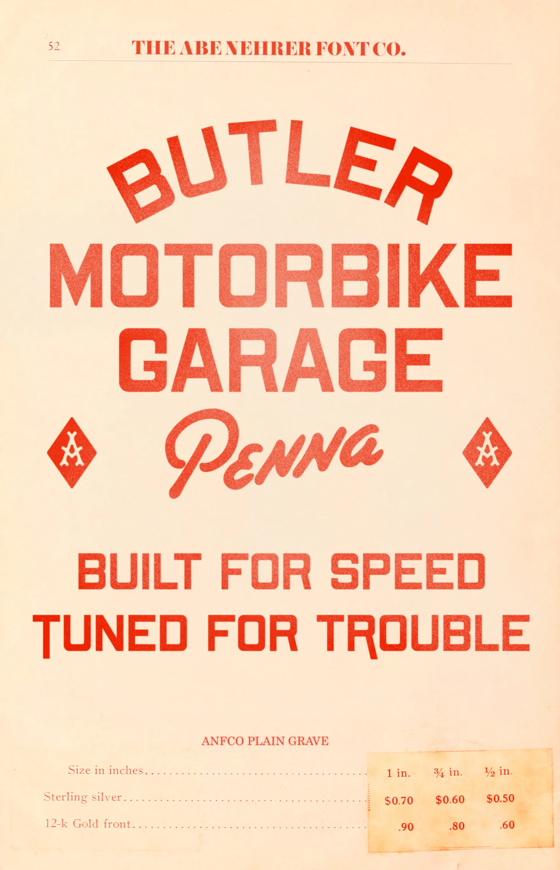
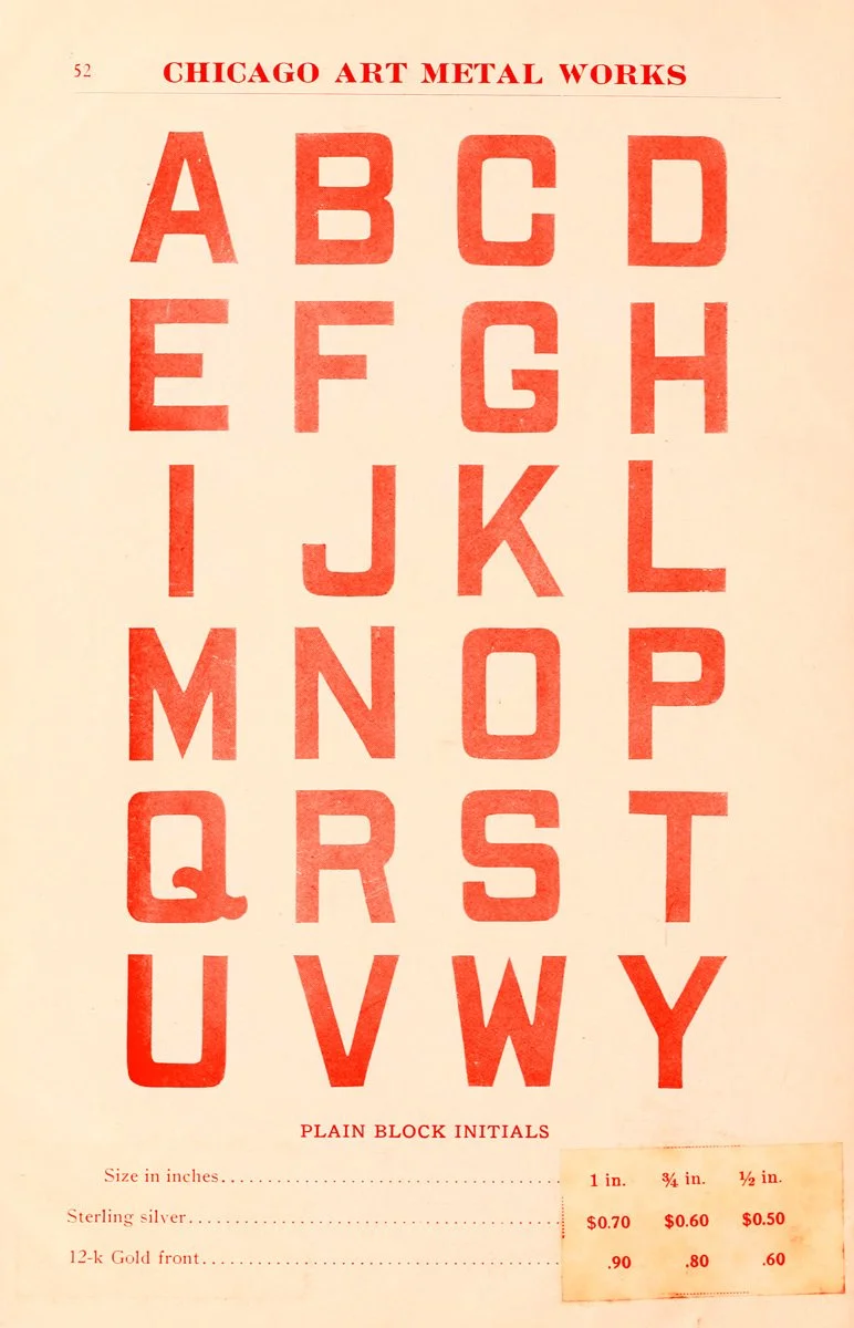
Typographic design show using the ANFCo Plain Grave font combined with a bit of hand lettering.  The text read "Union Market quality meats established 1935" in a vintage style with the word "Famous" above it.
Label for Chambersburg Athletics, established in 1803, describing its history as a historic town in Pennsylvania known for its rail connections, storefronts, and regional commerce, with a quote about whiskey being a staple in American trade and tradition, and includes historical illustrations of a train and a woman on a cart.
Early 20th century style typeface ANFCo Plain Grave used in a typographic lockup that states "River District Champs Wisconsin" with the word 'champs' being hand written.  It has a vintage americana feel to it.
A vintage Chicago Art Metal Works advertisement displaying alphabet letters in bold red block initials, titled 'Plain Block Initials,' - it is the inspiration for the ANFCo Plain Grave font.

ANFCO PLAIN GRAVE

ANFCo Plain Grave is based on an alphabet found in an old metalworks catalog. The original letters were hand cut, solid and practical, but a little rough around the edges. I tightened the forms for modern use while keeping some of the quirks that gave the originals their character.

You’ll notice tight curves inside the open letters and horizontals that run slightly heavier than the verticals, an uncommon detail in most sans serif typefaces. These small irregularities give the face a subtle edge and keep it from looking like the countless clean, neutral sans serifs out there.

Plain Grave is primarily a display typeface, but it holds up well in short paragraphs. It’s right at home on labels, posters, badges, and anything that needs a vintage look without screaming it.

Vintage style advertisement for Butle motorbike garage in Pennsylvania, featuring red text on a beige background with a textured effect and some branding elements.