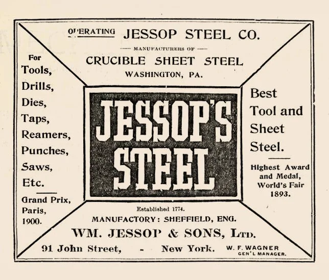
ABOUT ANFCO JESSOP
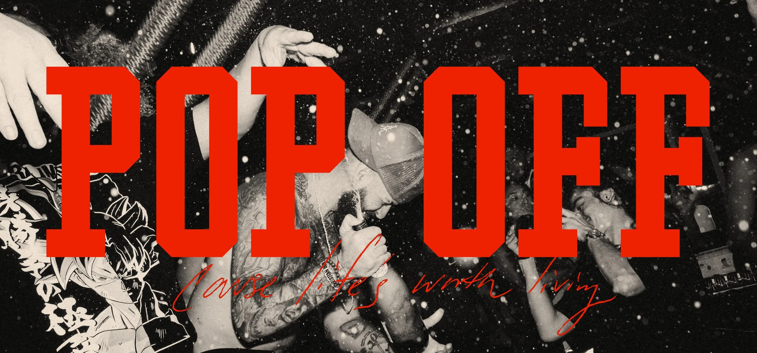
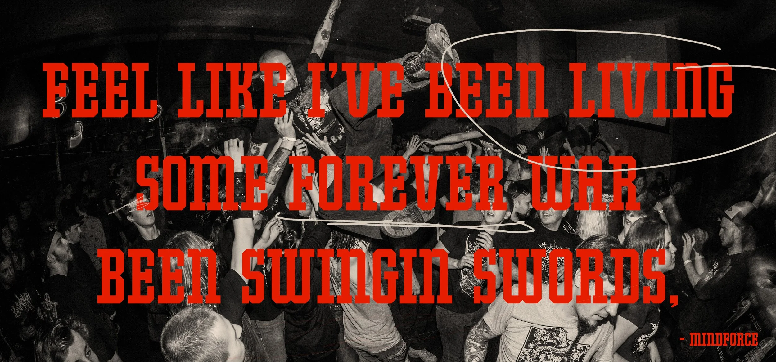
Jessop is a display font inspired by the old hand-made logo of the Jessop Steel Company. The letters are simple, but heavy. Unconventional slab serifs, chamfered corners, and that classic block serifed middle arm of the E that barely shows up anymore.
The original logo was hand drawn, so I tightened it up and built it for modern use.
It works on a hardware store sign, it works on a hardcore record sleeve, it works on a collegiate sweatshirt.
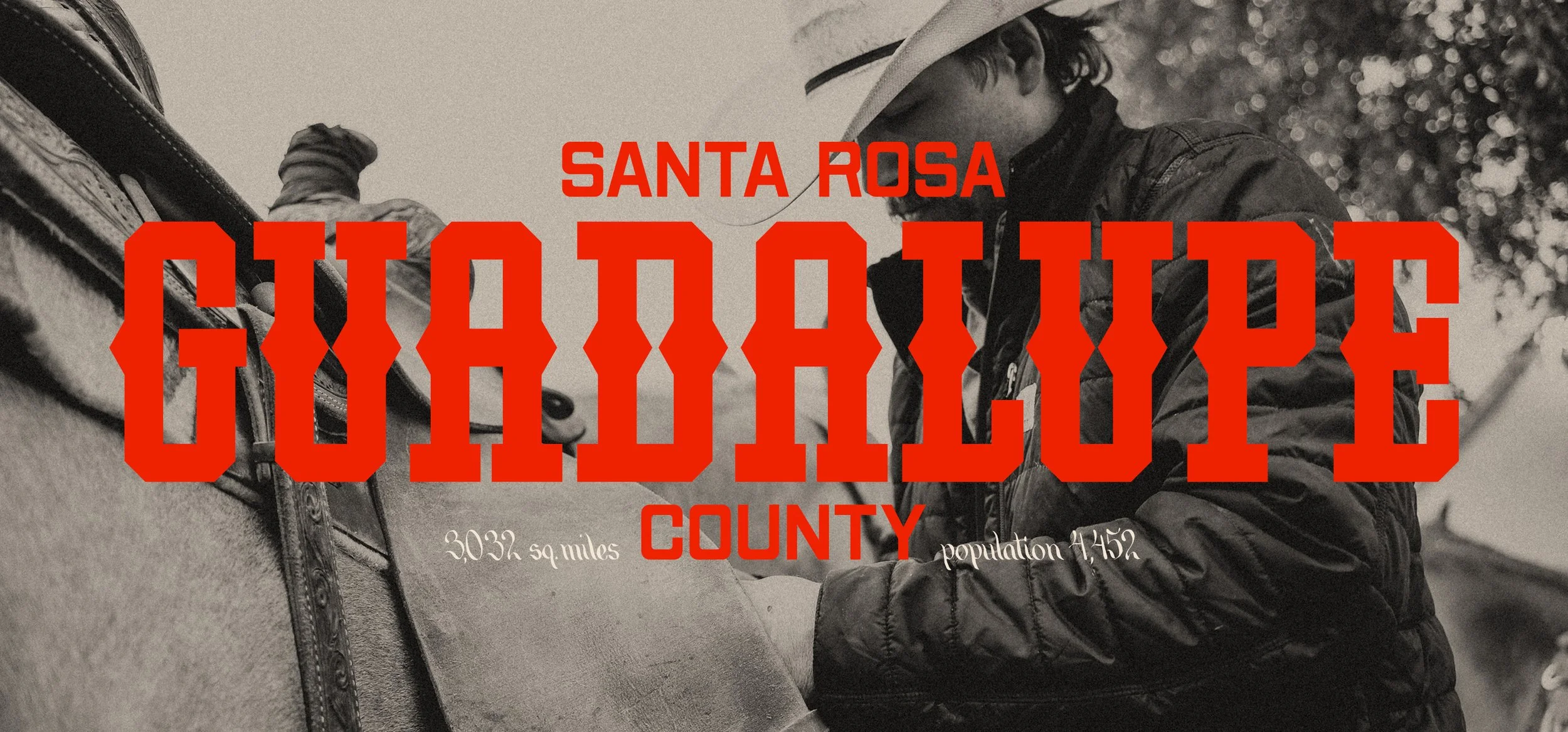
From the standard block, I took it a step further with thick triangular spurs pushing it from East Coast steel city to Western ranch. Jessop Spurred lands somewhere between a taco truck and a woodblock wanted poster.
Strong without being sharp. Hard like iron. Built to endure.
Jessop isn’t just about nostalgia, it’s about a new block letter for the present day. A blue-collar typeface for designers who still like weight in their work, and are looking for a robust typeface that can handle the load.